


GERTRUDA DAMBRAUSKAITE
A2 Media Portfolio
Magazine Advertisement Analysis 3
Black and white photo gives a more emotional feel to the advert which coincides with her brand of personal song writing and a 'classy' brand image.
The advert also features the image of the album so that the audience know exactly what her album looks like.
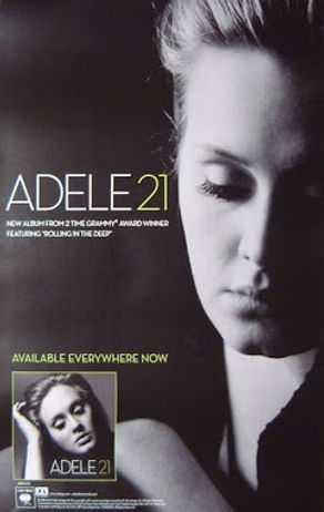
The rule of thirds of the artist gives the advert a clean and simplistic look which conforms to the singer-songwriter convention. Furthermore, because of the rule of thirds it makes the other information of the advert stand out as well as making it clear for the consumer to see.
Title of the album is written in a simplistic font which conforms to the singer-songwriter genre. The simplistic font also makes it easier for the consumer to see what the album is called and who it is by which makes it easier for her audience to identify.